How to create a brand style guide for UK businesses
Running a small business in the UK means juggling countless priorities, and brand consistency often slips through the cracks. Without clear guidelines, your logo might appear differently across platforms, your messaging could feel disjointed, and customers struggle to recognise your business. A brand style guide solves this by creating a single reference document that defines exactly how your brand looks, sounds, and presents itself across every touchpoint. Whether you’re a startup founder or an established business owner refining your identity, this practical guide walks you through creating a style guide that actually gets used.
Table of Contents
Key takeaways
| Point | Details |
|---|
| Brand consistency builds trust | A style guide ensures your visual and verbal identity remains uniform across all customer touchpoints |
| Essential components matter | Include logo usage rules, colour palettes, typography, imagery guidelines, and tone of voice |
| Keep it practical | Overly complex guides gather dust, so tailor yours to your business size and actual needs |
| Regular updates required | Review your guide periodically to reflect brand evolution and market changes |
| Accessibility is crucial | Ensure colour contrast and design choices work for all audiences across different media |
Understanding the importance of a brand style guide
Many small UK businesses operate without consistent branding, which directly impacts customer trust and perception. Small businesses often struggle with brand consistency due to limited resources and expertise, creating a fragmented identity that confuses potential customers. Your brand encompasses far more than just a logo. It represents your entire visual and verbal identity, from the colours you use to the way you communicate with customers.
A brand style guide acts as your business’s visual and verbal rulebook. It defines precisely how your brand should appear and sound across every platform, whether that’s your website, social media, packaging, or printed materials. This consistency isn’t just about aesthetics. Brand building is critical when starting and growing a business, establishing the foundation for customer recognition and loyalty.
The business case for creating a style guide is compelling. Research demonstrates that businesses with style guides appear more professional and trustworthy to potential customers. When your branding looks polished and consistent, customers perceive you as established and reliable, even if you’re a relatively new business. This perception translates directly into competitive advantage in crowded markets.
Consistency in branding creates familiarity, and familiarity breeds trust. Small businesses that maintain coherent visual and verbal identities across all touchpoints see measurable improvements in customer engagement and brand recall.
Beyond external perception, a style guide serves practical internal purposes. It streamlines decision making when creating new materials, reduces back and forth with designers or agencies, and ensures anyone working on your brand delivers consistent results. For small businesses with limited marketing resources, this efficiency saves both time and money whilst maintaining professional standards.
Preparing to create your brand style guide
Before drafting your actual guide, gather all existing brand assets in one place. Collect your current logo files in various formats, any colour palettes you’ve used, fonts, imagery, and examples of previous marketing materials. This audit reveals what you already have and highlights gaps or inconsistencies that need addressing. You might discover you’ve been using three different shades of blue or two slightly different logo versions, problems your new guide will solve.
Clarifying your brand identity forms the essential foundation. Your brand identity extends beyond visuals to include positioning and mission, so articulate these clearly before documenting visual elements. Ask yourself fundamental questions: What does your business stand for? Who are you trying to reach? What makes you different from competitors? What personality traits define your brand? These answers inform every decision in your style guide.
Consider these preparation steps:
- Define your brand mission and core values explicitly
- Identify your primary and secondary target audiences
- Articulate your unique selling proposition clearly
- Determine the personality traits your brand embodies
- List the emotions you want customers to feel
- Clarify how you differ from direct competitors
Your tone of voice deserves particular attention during planning. This isn’t something you can retrofit later. Think about whether your brand sounds formal or casual, technical or accessible, serious or playful. A law firm and a creative agency serving similar sized businesses will have vastly different tones, and yours should authentically reflect your business personality whilst resonating with your target audience.
For businesses with multiple product lines or sub brands, map out their relationships now. Decide whether sub brands should feel like part of a family or stand independently. This structural clarity prevents confusion when documenting guidelines and ensures your style guide addresses these relationships explicitly.
Pro Tip: Consider accessibility from the start rather than retrofitting later. Plan colour combinations with sufficient contrast for visually impaired users, and think about how your brand works across different media and contexts. This inclusive approach expands your potential audience whilst demonstrating social responsibility.
Executing your brand style guide: essential components and structure
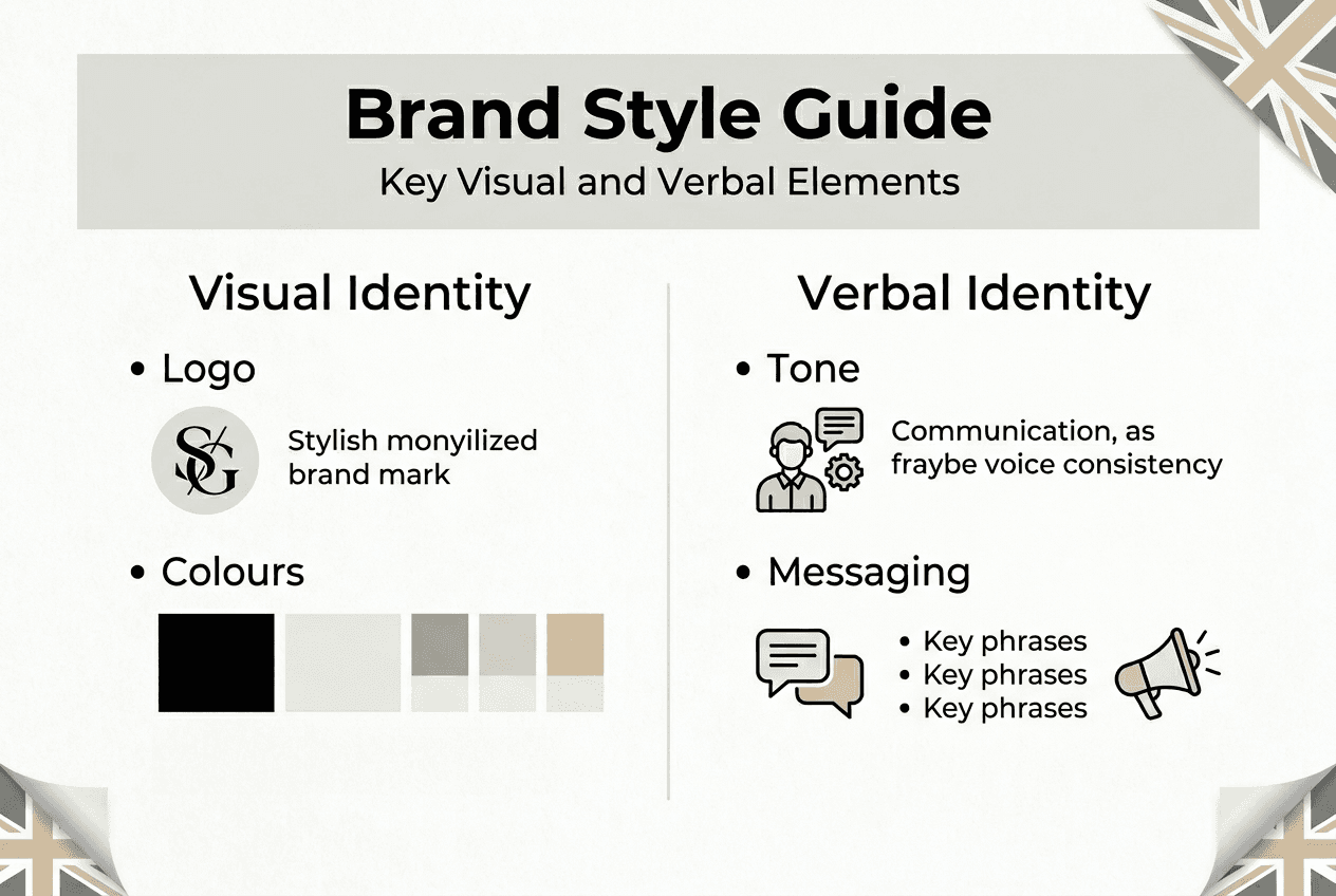
Your brand style guide needs specific sections that address both visual and verbal identity comprehensively. Core components include logo usage, colour palettes, typography, imagery, and brand voice, each serving distinct purposes in maintaining consistency. Let’s break down how to document each element effectively.
Start with logo usage guidelines that show correct and incorrect applications visually. Include your primary logo, any secondary versions or icon only variants, and specify minimum sizes for legibility. Show clear space requirements around the logo to prevent crowding. Create a visual grid demonstrating wrong uses: stretched logos, recoloured versions, logos on busy backgrounds, or rotated orientations. These examples prevent common mistakes by showing explicitly what not to do.

Your colour palette section should document every official brand colour with precise specifications. List hex codes for digital use, RGB values for screens, CMYK for print, and Pantone references if applicable. Organise colours into primary, secondary, and accent categories. Include guidance on colour combinations and specify which backgrounds work with which text colours, ensuring sufficient contrast for accessibility standards.
Typography guidelines prevent the visual chaos that occurs when different team members choose different fonts. Specify your heading font, body text font, and any accent fonts with exact names and weights. Clarify where each font appears: websites, printed materials, social media graphics. Include fallback fonts for situations where your primary choices aren’t available. Show hierarchy examples demonstrating how different heading levels and body text work together.
Imagery guidelines maintain visual consistency across photography, illustrations, and graphics. Describe your preferred style: bright and airy versus moody and dramatic, candid versus staged, lifestyle versus product focused. Show examples of on brand and off brand imagery. If you use illustrations or icons, specify the style, colour treatment, and level of detail. This section ensures visual content feels cohesive even when created by different people.
The tone of voice section often gets overlooked but drives customer engagement significantly when implemented consistently. Describe your brand personality using clear adjectives, then translate these into practical writing guidelines. Include do’s and don’ts with specific examples. Show how you handle common scenarios: welcoming new customers, addressing complaints, announcing new products. Provide a short list of preferred phrases and words to avoid.
Follow this structure to assemble your guide:
- Create a cover page with your brand name and guide version date
- Write a brief introduction explaining the guide’s purpose and who should use it
- Document your brand story, mission, and values concisely
- Detail logo usage with clear visual examples of correct and incorrect use
- Specify your complete colour palette with all technical codes
- Define typography rules for different contexts and media
- Establish imagery and graphics guidelines with visual examples
- Articulate your tone of voice with practical writing examples
- Add any additional elements specific to your business
- Include contact information for brand questions or approvals
| Element | Purpose | Common mistakes |
|---|
| Logo usage | Ensures consistent brand mark application | Stretching, recolouring, insufficient clear space |
| Colour palette | Maintains visual identity across media | Inconsistent shades, poor contrast, accessibility issues |
| Typography | Creates hierarchy and readability | Too many fonts, wrong weights, poor pairing |
| Imagery | Establishes visual style and mood | Inconsistent styles, off brand subjects, quality issues |
| Tone of voice | Defines communication personality | Inconsistent messaging, undefined audience, generic language |
Pro Tip: Keep your language straightforward and visual examples abundant. The easier your guide is to understand and follow, the more likely your team will actually use it. Avoid design jargon unless your audience understands it, and always show rather than just tell.
Maintaining and using your brand style guide effectively
Creating your guide is only the beginning. The real value emerges from consistent use and regular maintenance. Review and update your guide periodically to reflect business changes and market trends, ensuring it remains relevant and accurate as your business evolves. Set a recurring calendar reminder to assess whether your guide still reflects your current brand accurately.
Schedule formal reviews at logical intervals based on your business cycle. For most small businesses, annual reviews work well, though rapidly growing companies might need quarterly assessments. During reviews, evaluate whether your colours still feel current, if your logo works across new platforms you’ve adopted, and whether your messaging reflects your evolved positioning. Update version numbers and dates so everyone knows they’re working from current guidelines.
Training your team and external partners on using the guide prevents inconsistencies before they happen. When onboarding new employees, marketing agencies, or freelance designers, walk them through your guide explicitly. Don’t assume they’ll read it thoroughly on their own. Highlight the most commonly used elements and explain why consistency matters to your business. Make the guide easily accessible, whether that’s a shared cloud folder, internal wiki, or printed copies at desks.
Watch for these common pitfalls:
- Overcomplicating the guide with excessive detail that overwhelms users
- Neglecting the tone of voice section entirely
- Failing to show visual examples of correct and incorrect usage
- Creating the guide then never referencing it again
- Making it difficult to access or find when needed
- Ignoring accessibility considerations in colour and design choices
Use your style guide as a practical checklist when approving any customer facing materials. Before publishing social media graphics, printing brochures, or launching website updates, verify they align with your documented guidelines. This quality control process catches inconsistencies early and reinforces the guide’s importance across your organisation.
For businesses managing sub brands alongside a master brand, your guide should clarify relationships explicitly. Define which elements remain consistent across all brands and where variation is acceptable. A parent company might maintain consistent typography and tone whilst allowing sub brands unique colour palettes. Document these rules clearly to prevent confusion and maintain overall brand architecture coherence.
Consider appointing a brand guardian, someone responsible for maintaining the guide and answering questions. This doesn’t require a full time role. Even in small businesses, designating one person as the go to for brand decisions ensures consistency and prevents the guide from being ignored or misinterpreted. This person becomes your internal expert who can approve materials and guide team members.
How Yoonyn can help you create a brand style guide
Developing a comprehensive brand style guide requires strategic thinking, design expertise, and understanding of how small businesses actually work. Yoonyn specialises in creating practical, usable brand guidelines tailored specifically for growing UK businesses. We’ve helped numerous small business owners transform fragmented identities into cohesive, professional brands that build customer trust and drive growth.
Our approach combines strategic brand development with practical implementation support. We don’t just hand you a document. We work with you to define your brand identity, create comprehensive guidelines, and train your team on using them effectively. Whether you’re starting from scratch or refining an existing brand, our services ensure you achieve consistency without sacrificing the flexibility small businesses need. Explore how Yoonyn can save you time whilst elevating your brand’s professional impact.
FAQ
What is a brand style guide?
A brand style guide is a comprehensive document that outlines your brand’s visual and verbal identity to ensure consistency across all communications and touchpoints. It defines precisely how your logo, colours, typography, imagery, and messaging should appear, providing clear rules that anyone creating branded materials can follow. The guide helps all stakeholders, from employees to external agencies, use your brand elements correctly and consistently.
Why is tone of voice important in a brand style guide?
Tone of voice ensures your communication matches your brand personality consistently across every customer interaction, from website copy to social media posts to customer service emails. When your verbal identity remains coherent, customers recognise your brand instantly and feel they’re interacting with a consistent entity rather than a fragmented business. Research shows that consistent tone of voice increases engagement by building trust and familiarity with your audience.
How often should I update my brand style guide?
You should review your style guide regularly to reflect business changes and market trends, typically annually for most small businesses. Schedule formal reviews after major business milestones like rebrands, significant product launches, or expansion into new markets. Minor updates might happen more frequently as you refine specific elements, but avoid constant changes that prevent your brand from becoming established in customers’ minds.
What common mistakes should I avoid when creating a brand style guide?
The most frequent mistake is making your guide overly complex or detailed beyond your business needs, which discourages actual use. Keep your guide concise and practical, focusing on elements you’ll genuinely use rather than exhaustive documentation that overwhelms users. Don’t overlook crucial components like tone of voice, which many businesses skip despite its importance for consistent communication. Tailor complexity to your business size, a solo entrepreneur needs something far simpler than a company with multiple departments and external agencies.
Do I need different brand guidelines for digital and print?
Whilst your core brand elements remain consistent, you should address how they adapt across different media within your style guide. Digital applications might specify screen optimised colour codes and web safe fonts, whilst print sections include CMYK values and paper stock recommendations. Rather than creating separate guides, include medium specific guidance within relevant sections. Your logo usage rules might note minimum sizes differ between screen and print, or your colour section might list both hex codes and Pantone references.
How do I ensure my team actually uses the brand style guide?
Make your guide easily accessible by storing it where your team naturally works, whether that’s a shared drive, project management tool, or company intranet. Train team members explicitly on using it rather than assuming they’ll figure it out independently, walking through the most commonly referenced sections. Keep the guide concise and visual so people can find answers quickly without wading through dense text. Assign a brand guardian who can answer questions and approve materials, creating accountability whilst supporting consistent implementation across your organisation.